A Fresh Coat

Feature Walls

CHURCH CRY ROOM RENOVATION

Feature WallsJenny SulpizioComment

I was back at our church this past week working on a little room renovation/makeover. The CRY ROOM is an area of the church where mothers can nurse, change their kiddos if need be, or retreat when said cherubs choose to get a little cray-cray. My kids are well past this phase (well, most days at least), so I personally had no use for this room. That being said, after checking it out, I knew I really wanted to tackle this space within our church next. Afterall, the cry room should exude warmth, instill peace, and serve as a retreat (of sorts) when our body of mamas need to use it.

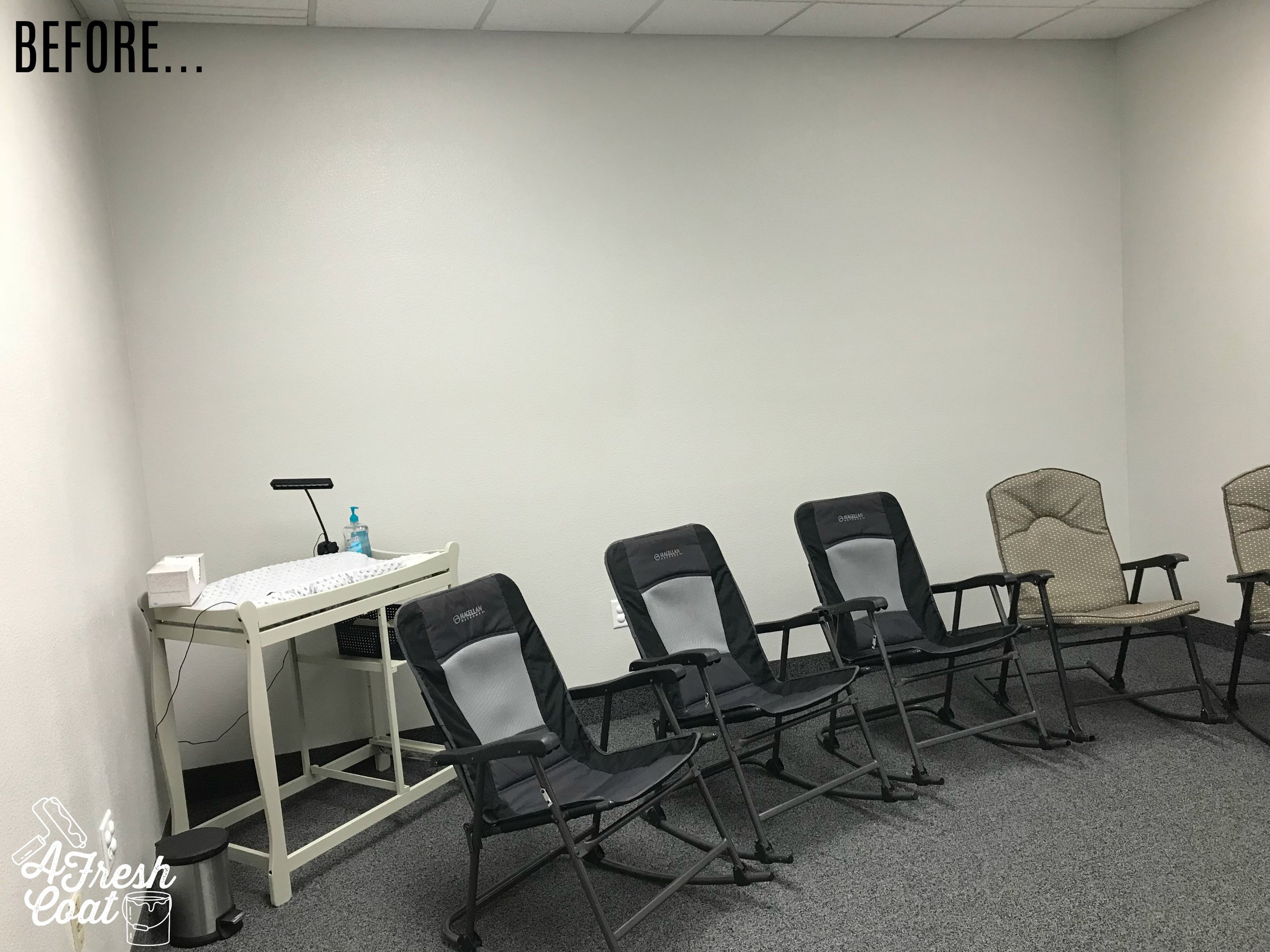
Here is where we started:

See what I mean? These bare walls and temporary rockers needed some assistance just as this room needed a little facelift.

Ready to see this room renovation?

Church Cry Room Reno- A Fresh Coat Yuma 07.jpg
Church Cry Room Reno- A Fresh Coat Yuma 01.jpg

And here's how it all went down:

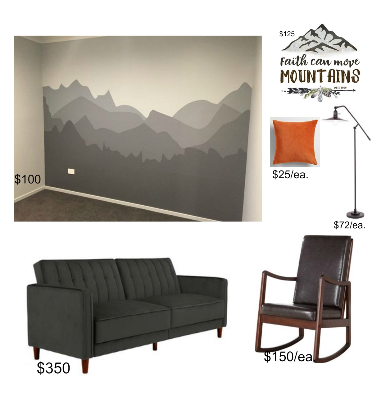
After resorting to Pinterest and checking out numerous nurseries online, I selected a mountain scene wall mural to serve as the main design of this space. Besides, I'd been wanting to tackle this little gem for quite a while and was excited at the opportunity to finally get to do so.

IMG_2395.PNG

Cute, huh? Now for the rest of the room. I made this preliminary design board using images mostly found on Pinterest.  We needed economical, yet comfortable furniture that would be functional, aesthetically pleasing, and budget-friendly. I selected both of these modern rockers paired with a basic grey couch I found on Wayfair. 

IMG_2335.jpg

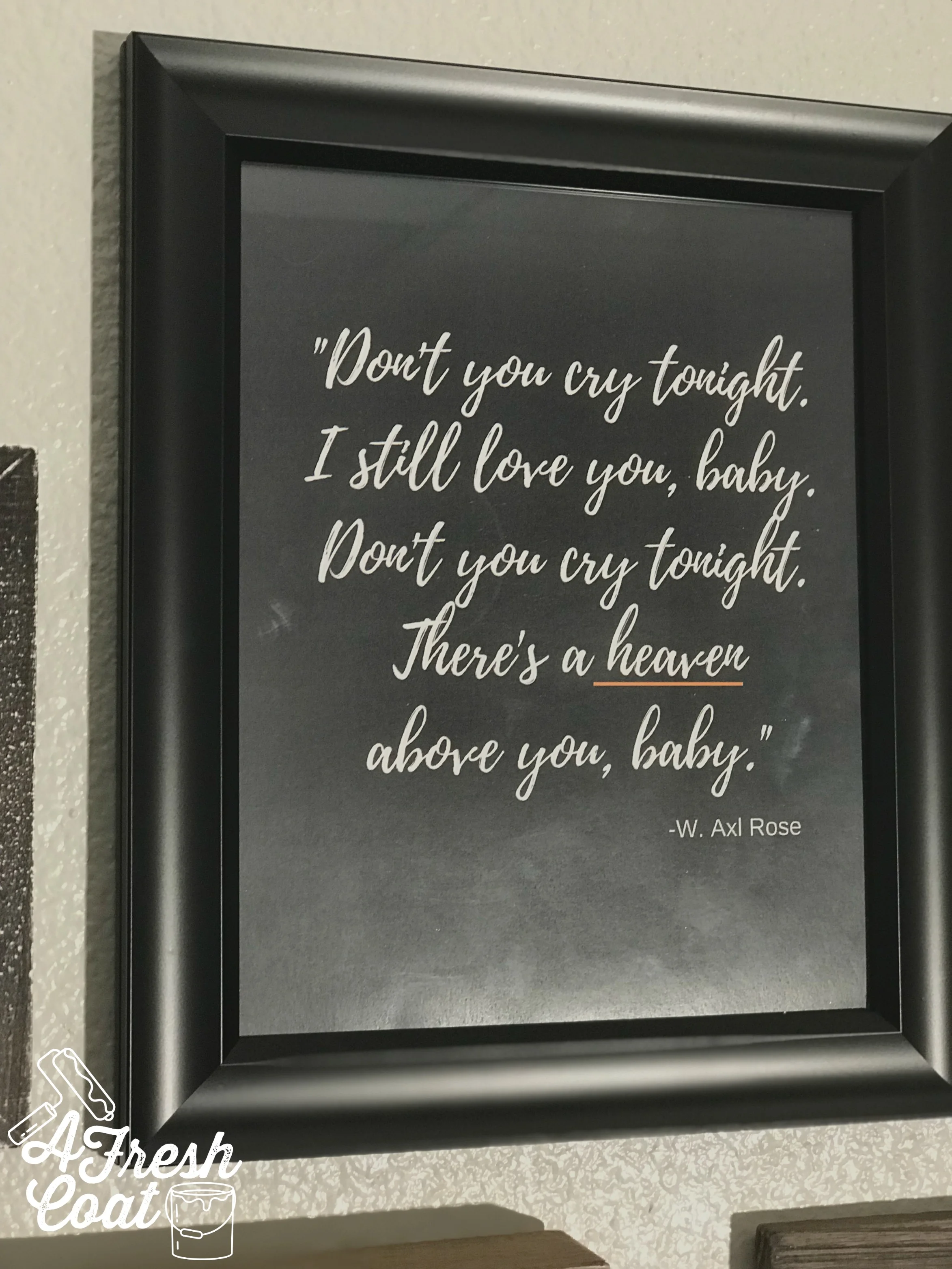
Next up? The mini gallery wall. Seriously, EVERY time I hear the word "cry" I think of that song from Guns n' Roses. You know the one. So much so, that I felt the need to implement some of the song's lyrics into this space. I mean, it IS the Cry Room and it works. It's fun and even better? When weary mamas are using this room. it may just bring a much needed smile. 

The rest of these items and frames were found at Hobby Lobby. Oh, and that "Pray Big" sign looked awesome when I originally purchased it in black but this area needed a pop of orange to help balance it with the main feature wall. A little spray paint to the rescue!

Church Cry Room Reno- A Fresh Coat Yuma 04.jpg

That's it! Future plans for this room include a new changing table. Something rustic and non-traditional (with lots of storage) but in the meantime, this place is ready for our church body of mamas and all their wee ones.

The Details:

Couch & Rocker Chairs: Wayfair

Rug & Coffee Table: Ashley Furniture Store

Wall Gallery Decor: Hobby Lobby

Printables: A Fresh Coat Yuma

Wall Mural: A Fresh Coat Yuma

Copper Vinyl Triangles: Lindsey Elk

Pillows: Hobby Lobby & Kirkland's

Table Centerpiece: Kirkland's

Paint Colors: SW Urbane Bronze, SW Cattle Drive, SW Dovetail (25% reduction)


Missions Ministry Wall

Feature WallsJenny Sulpizio6 Comments

This welcome center wall had been itching for some TLC for a long while. So when the Missions Team at The Rock Church (Yuma, AZ) approached me on reconfiguring this space, I jumped at the chance. With families serving in South America and beyond, the goal was to highlight the work being done abroad as well as the service projects taking place right here in Yuma...all on a budget.

After searching Pinterest and talking to the Missions teams directors, we figured on some pictures, an oversized map, some signage, and a display case to provide information on our missionaries and upcoming missions work.

Here is where we started:

Missions Ministry Wall 03 copy.jpg

And here is the finished wall:

Missions Ministry Wall 07.jpg

1.) The Map: I wanted to include an oversized map of the world to serve as the backdrop for the rest of the elements on this wall. Local vinyl phenom, Lindsey Elk created this gorgeous black matte piece and even installed it for me too. She's awesome. The contrast of the dark black on top of that painted SW Dovetail wall is dramatic and seriously striking!

2.) Canvas Photos: I love the look of a canvas photo collage. It's simple, clean, and makes a huge impact. By combining stock photos and mission trip pics in various sizes, AFC was able to really set the mood and tone of this wall. Using my "go-to" for canvas prints (www.easycanvasprints.com), a little editing on Pic Monkey to lighten, brigthen, and alter the hues just a bit, and then by adding a fantastic rustic frame (thanks, Nate Koogle!) to accent our beautiful African girl, the wall began to transform.

Missions Ministry Wall 04.jpg

3. Signage: Letters, signage, and the likes can really take its toll on one's budget and since this was a church project, moola was scarce (appropriately so). However, I really wanted to add some industrial letters to coordinate with the rest of the welcome center and direct parishioners/visitors attention to this wall.

In an effort to save money, I found these paper mache letters on HobbyLobby.com for $1.50 a piece (on sale).

Missions Ministry Wall 01.jpg

I then picked up a can of silver, hammered spray paint (I love me some spray paint) and got to work making each letter appear to look like metal. 

Missions Ministry Wall 02.jpg

Next, I distressed them using ink (of all things) and boom(!)---rustic metal-looking letters for crazy cheap.

Missions Ministry Wall 03.jpg

The remaining "ministry" signage was custom made from a great shop on Etsy. I ordered this piece in a raw metal finish and then spray painted it upon arrival. I really wanted to tie in the orange hue found in both the floors of the lobby as well as the matching decor.

Missions Ministry Wall 06.jpg
Missions Ministry Wall 05.jpg

While this wall is close to completion, it still needs a few more special touches;   a kiosk to help balance out the top and bottom, lighting to highlight those pictures and create even more interest in this wall, and possibly some interactive screens to showcase our missionaries and the work they're doing abroad.

The Details

Paint: SW Dovetail Gray

Vinyl World Map: Lindsey Elk-Yuma, AZ

Canvas Collage: www.easycanvasprints.com

Industrial Letters: Hobby Lobby

Display Case: www.displays2go.com

Ministry sign: Shop Simply Inspired--Etsy

Rustic Picture Frame: Nate Koogle-Yuma, AZ

Love, J

FEATURING...WALLS!

Feature WallsJenny Sulpizio1 Comment

The idea and main purpose of a feature wall within a room of your home is to make it just that--the main feature--the first place your eyes focus when walking into a room. The cool thing? Feature walls can be done in so many different ways and the possibilities are endless. Here are just a few examples of ideas to add some serious character to a room (or rooms) in your home. And? The majority of these walls can be done on a budget. Love that!

1.) WOOD. Horizontal planks have quickly become a popular way to add personality to a wall within your home. I have wood walls in two different rooms of my house--one in a deep gray and the other in rustic stained pallet pieces. I love the look of them, have yet to tire of them after four years, and wish I could add even more (but alas, overkill).

In the pic below, "T" wanted a rustic wood wall. His existing furniture had a deep cherry finish so AFC used a mixture of stains to create the wall you see below. However, the window moldings and finishing touches really make this room (can't wait to show you  in an upcoming blog post soon).

Wood Wall-A Fresh Coat Yuma.jpg

Wood walls don't have to be cut into sections either. Long, larger pieces of wood can run the width of your wall as well.

wood Wall-A Fresh Coat YUma 2

This wall (shown below) at The Rock Church in Yuma, AZ was a whole different story. The goal was to tie in the adjacent orange wall, and the rest of the contemporary elements in the room. The lobby has a lot of black and grey so by adding the wood, warmth ensues. This wood actually came from a twenty year-old fence on the property that was taken down. AFC then stained these pieces using four different stains and a mixture thereof.

Wood walls can be subtle, semi-subtle, or carry a super strong presence. It's all a matter of preference.

21458197_664743903728566_2044101531562193208_o.jpg

2. MOLDINGS. Moldings are one of my favorite ways to dress up a wall. They add so much depth, texture, and dimension. They kick everything up a notch. A bit pricier and more involved, the end result is well worth it.

This navy wall received the royal treatment. While a navy wall is gorgeous on its own, a navy wall with moldings is ten times better (at least IMO). The picture below shows exactly what I mean. A total showstopper!

Unknown.jpeg

In Arizona-especially with older housing--the majority of our walls have a textured finish. When it comes to adding moldings, it's personal preference as to whether to leave the textured walls showing or to cover them for a smoother finish (like in the image below).

Board and batten was added to the TV wall to lighten and brighten the area, combine with the features of the fireplace, and give a punch of character to the whole room.

Moldings rule.

3. PAINT. Feature walls can be as simple as using one (or two, or three) color(s) of paint to transform them.  I'm a huge fan of a strong, black wall. Black makes everything pop and how amazing does this cow print (featured in a cattle feedlot office of all places), look with that dark hue behind it? No other color could achieve such a dramatic look. One gallon of paint at $35 and look at the difference this feature wall makes. 

14917228_541189329417358_4602321806160868878_o.jpg

However, black isn't the only color a feature wall can rock (obviously). In the room pictured below, we used SW Dovetail Gray to make that amazing cedar bed really come to life. The dark grey in duo with the Pier 1 bedding adds warmth to the room. It makes it cozy and inviting. I seriously want to curl up and read a book on that bed. Too bad it's not mine. LOL.

14543890_532217030314588_2919177661698541531_o.jpg

Same thing here. "K" really wanted a green feature wall, and not one to disappoint, green is what he got. This bright wall looks brilliant paired with his three light grey remaining walls and really pops. Paint can do amazing things in a room, especially when it comes to accenting one in a darker color. 

Tween Jungle Room | A Fresh Coat Yuma.jpg

4. PAINT TECHNIQUES & WALL MURALS. There are feature walls and then there are FEATURE WALLS. "R" and "W" share a room and really wanted a camo wall. Having not attempted camo before, I couldn't wait to jump on the chance to do so and offered a significant savings to my client for letting me try. I think the result is pretty fun and I also heard that these boys love to show their room (and especially their feature wall) off to all who enter their home. Love that!

16797558_582961995240091_3309322675533195928_o.jpg

Stripes. If you've visited this blog before, you know I'm a sucker for painting stripes. I love the look of them, as well as how clean and crisp they appear. They really are my favorite technique to paint. But stripes don't have to take up a whole wall or be limited to just one wall of your space either. This beautiful cream colored stripe (SW Eider White with SW Agreeable Grey) is simple yet gorgeous in this teen girl's room makeover. I love the decor her mama and grandma picked out as well. Simple and classic.

12662019_451600308376261_6524772118870025353_n.jpg

Wall Murals are a ton of fun. They are fun to look at and for me, even more fun to paint. They look great in bedrooms, hallways, offices, and more. I was given the wonderful opportunity to create this desert landscape at the family center of Crossroads Mission in Yuma, AZ last year. It really livens the space up and gives residents a new space/place to spend time together. This once bare wall immediately transformed this entire resident's wing...and that's super fun.

18010242_608060269396930_1870470250231226725_n.jpg

No matter what type of feature wall you select, I really think you can't go wrong. Whether subtle and understated, or vivid and detailed, feature walls make all the difference in a room. So, what's your style? What are you thinking of achieving in your space?

Love,

J